
Projects
Examples of how I use design to improve learning, decision-making, and adoption in health systems.
.1.svg)
.2.svg)
.3.svg)
.4.svg)
.5.svg)
Reimagining the ECOWAS Annual Report
Client: GIZ ECOWAS Cluster
Role: Information Designer, Editorial Lead, Communications Strategist
Focus: Information Architecture, Editorial Design, Data Visualization

The ECOWAS Cluster Annual Report brought together contributions from approximately eight programs working across different thematic areas and countries.
The challenge was not a lack of information. It was the opposite.
Large volumes of content, multiple contributors, and varying writing styles made it difficult to communicate key achievements and lessons in a way that busy stakeholders could quickly understand and use.
The report needed to serve development partners, government stakeholders, ECOWAS institutions, and other regional audiences while presenting a coherent picture of the Cluster's work.
I led the editorial strategy, content structure, information architecture, visual design, data visualization, and editing process.
I also coordinated communications focal persons across programs to gather, refine, and organize content into a unified narrative.
Designing for readers, not reporting requirements
Traditional annual reports often prioritize completeness over usability.
I began by reframing the report around the needs of readers rather than the structure of individual programs. The goal was to help stakeholders quickly understand the most important achievements, challenges, and insights from the reporting period.
Building a clearer narrative
With contributions coming from multiple programs, one of the primary challenges was creating consistency.
I introduced a thematic structure supported by reader-focused summaries, allowing related work to be grouped together and presented within a broader regional story.
This shifted the report from a collection of individual program updates to a more coherent account of collective impact.
Improving scanability
A key design objective was making the report easier to navigate.
I restructured the information architecture so readers could quickly identify areas relevant to their interests without needing to read the document cover to cover.
This included:
- Summary pages highlighting key achievements
- Improved content hierarchy
- Stronger visual signposting
- Data visualizations that supported rapid understanding
- Clear pathways into more detailed sections
The result was a report that supported both quick scanning and deeper exploration.
What I am most proud of is helping transform a compliance-oriented document into something people genuinely wanted to engage with.
The project reinforced a lesson that continues to guide my work today: information becomes more valuable when people can quickly understand what matters, why it matters, and where to go next.
Good communication is not about presenting more information. It is about helping people make sense of complexity.
Reframed and redesigned a multi-program annual report into a more accessible communication product that improved how regional stakeholders understood and engaged with complex development information.
Data Visualization for HIV Prevention
Improving access to data visualization training for HIV prevention professionals across Nigeria.
Client: UNAIDS & NACA
Role: Learning Experience Designer, Content Strategist, Moodle Implementation Lead
Focus: Digital Learning, Workforce Development

Data visualization is an increasingly important skill for public health professionals, but training was primarily delivered through in-person workshops. These sessions were costly to organize, limited in reach, and difficult to scale across states and institutions.
The goal was to create a more accessible learning experience that would help public health practitioners build practical data visualization skills while reducing reliance on traditional workshop-based training.
I led the design and implementation of the learning experience, including user research, curriculum development, content structure, visual design, Moodle implementation, and testing.
Understanding learners
I worked with public health stakeholders to understand how professionals currently accessed training, the constraints they faced, and the skills they needed to develop.
A recurring theme was limited time. Many learners were balancing training alongside demanding program responsibilities, making long workshops difficult to attend and even harder to scale.
Designing for flexible learning
The course was structured as a self-paced learning experience that allowed participants to progress at their own pace.
To support different learning styles, the course combined:
- Audio lessons
- Interactive exercises
- Knowledge checks and quizzes
- Real-world examples
- Reflection activities
All learning materials were organized within a single platform, making it easier for participants to access resources, track progress, and continue learning over time.
Simplifying a complex process
Before the platform, training often required participants to travel to a physical location and attend workshops over several days.
The new approach simplified that process by making learning available on demand, reducing barriers to participation while creating a more consistent and measurable learning experience.
This project demonstrated how technology, learning science, and user-centered design can work together to solve persistent challenges in public health.
More importantly, it showed that improving access to knowledge does not always require creating new content. Sometimes the greatest impact comes from designing better ways for people to learn, apply, and retain what already exists.
Transformed a costly, workshop-based training model into a scalable digital learning experience that expanded access to data visualization training for HIV prevention professionals across Nigeria.
Mapping HIV Prevention Services Across Nigeria
Client: UNAIDS & NACA
Role: Systems Designer, Data Collection Lead, Implementation Consultant
Focus: Health Data, Decision Support, Public Health Systems
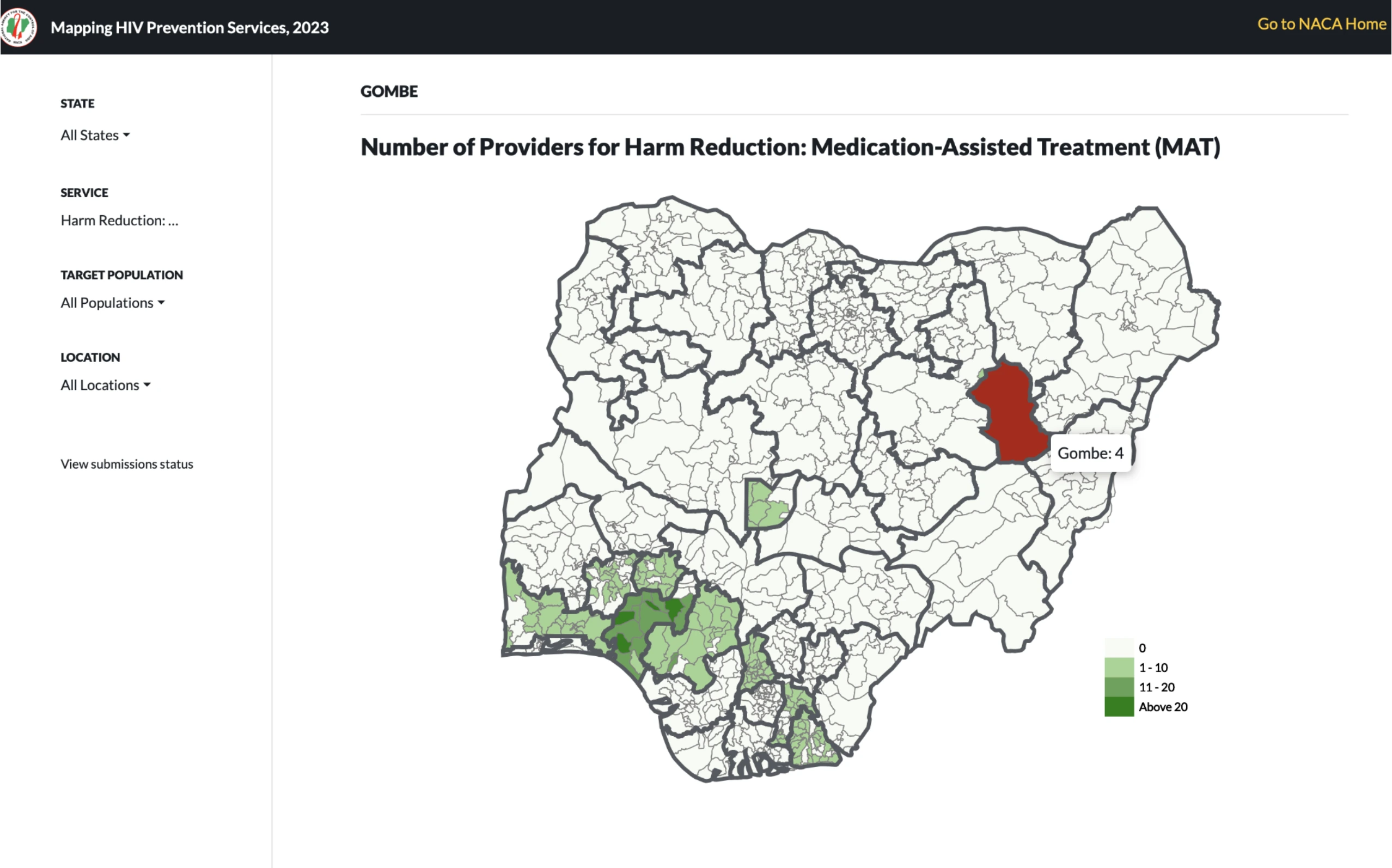
Effective HIV prevention requires accurate and up-to-date information about programs, services, and resources. However, data collection practices varied across organizations and locations, making it difficult to develop a comprehensive picture of HIV prevention efforts nationwide.
Without a standardized approach, stakeholders faced challenges coordinating activities, identifying gaps, avoiding duplication of effort, and allocating resources effectively.
The objective was to create a national assessment process that could collect consistent data across all 36 states and the Federal Capital Territory while remaining practical for implementing partners to complete.
I led the design and implementation of the assessment system, including workflow design, form architecture, data structure development, stakeholder engagement, testing, implementation, and results visualization.
The project combined Kobo for data collection, R for data analysis, and custom dashboards for reporting and exploration.
Designing for scale
The assessment needed to support data collection across diverse organizations operating in different contexts.
I designed a structured data collection framework that balanced national oversight with state-level ownership of data. This ensured that information could be collected consistently while remaining useful to local stakeholders.
Simplifying data entry
The assessment collected a large amount of information, creating a risk that users would feel overwhelmed during completion.
To reduce this burden, I incorporated:
- Conditional logic to show only relevant questions
- Validation rules to improve data quality
- Save-and-return functionality
- Iterative improvements based on user feedback
The result was a more manageable experience that guided users through complex reporting requirements without overwhelming them.
Making data easier to use
Collecting data was only part of the challenge.
The information also needed to be accessible and actionable.
To support analysis and decision-making, I developed visualizations and dashboards that allowed stakeholders to explore results by theme, geography, and program area.
Branching structures and location-level data, including Local Government Areas (LGAs), improved both accuracy and the usefulness of the final dataset.
One of the most rewarding outcomes of this project was seeing users become more confident in collecting and working with digital data.
Beyond the assessment itself, the project helped demonstrate how thoughtful system design, user-centered workflows, and accessible digital tools can strengthen public health practice at scale.
The experience reinforced an important lesson: better decisions begin with better data, but better data begins with better systems.
Designed and implemented a national HIV prevention assessment system that standardized data collection across Nigeria while improving usability, data quality, and access to decision-making insights.